DevBlog #12 What is level design and why it is important for game developers
Hi everyone,
Last week I’ve been working on level design and some of the UI elements. Why I spent whole week doing just that? – Because those are very important aspects of the game and it is a way how players will see it. Good level design will make game understandable and help players achieve their goal much easier.
For example, I have an upcoming game From Hell. It is a story of protagonist who after millennia spent in darkest pits of Hell feels deep remorse for sins and so is pardoned by Heaven , allowed to return to surface.
When we speak about Hell, most of us imagine this place as something that is deep beneath us, underground, so naturally, getting out of it would mean that we are going up.
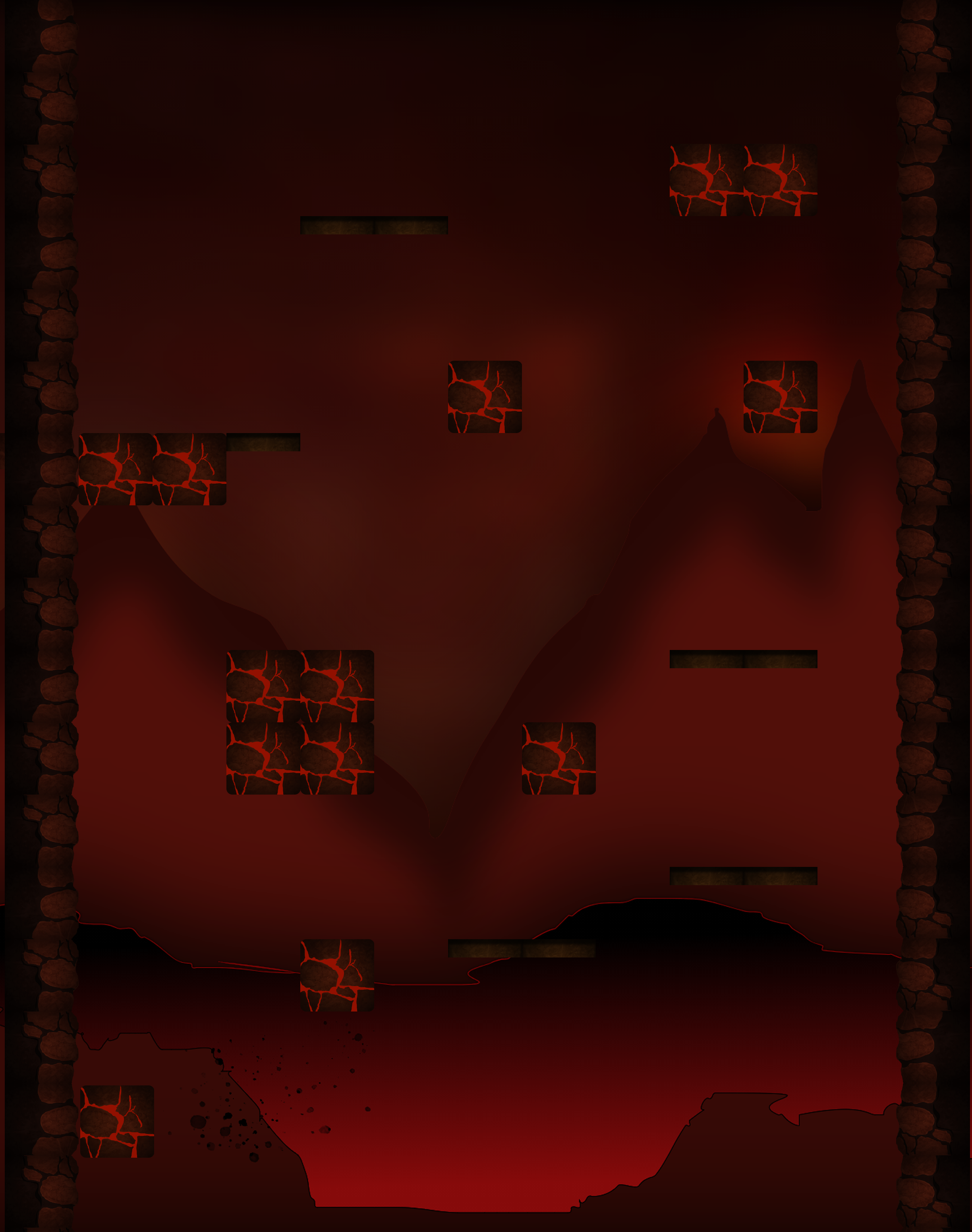
This perception then has to be transferred into the game as the core movement of going up. Upwards direction of course is vertical movement so naturally, the game itself should portray this idea strongly. As you can see in screenshot below, I have tried to do this in my game:

Jumping from one platform to other, destroying lava bricks (blocks with shiny red colored lines in them) on the way, player moves up to progress to the next level.
Alongside with that, there are multiple enemies that you can hit and can get hit as well, so naturally there has to be some health indicator that shows how much lives you have left. That’s where the UI comes in:

These are health points. In my game they are more as “faith” points – the more you get hit, the more faith points you lose. After you have lost final one, you get kicked back to the beginning of the level where you have to start over.
When it comes to displaying health bar and other UI elements that are shown on the screen during gameplay session, it is important to have them being seen easily if needed, but at the same time, they can’t overshadow the game’s arena and make hard time for players to see what is actually going on in the scene.
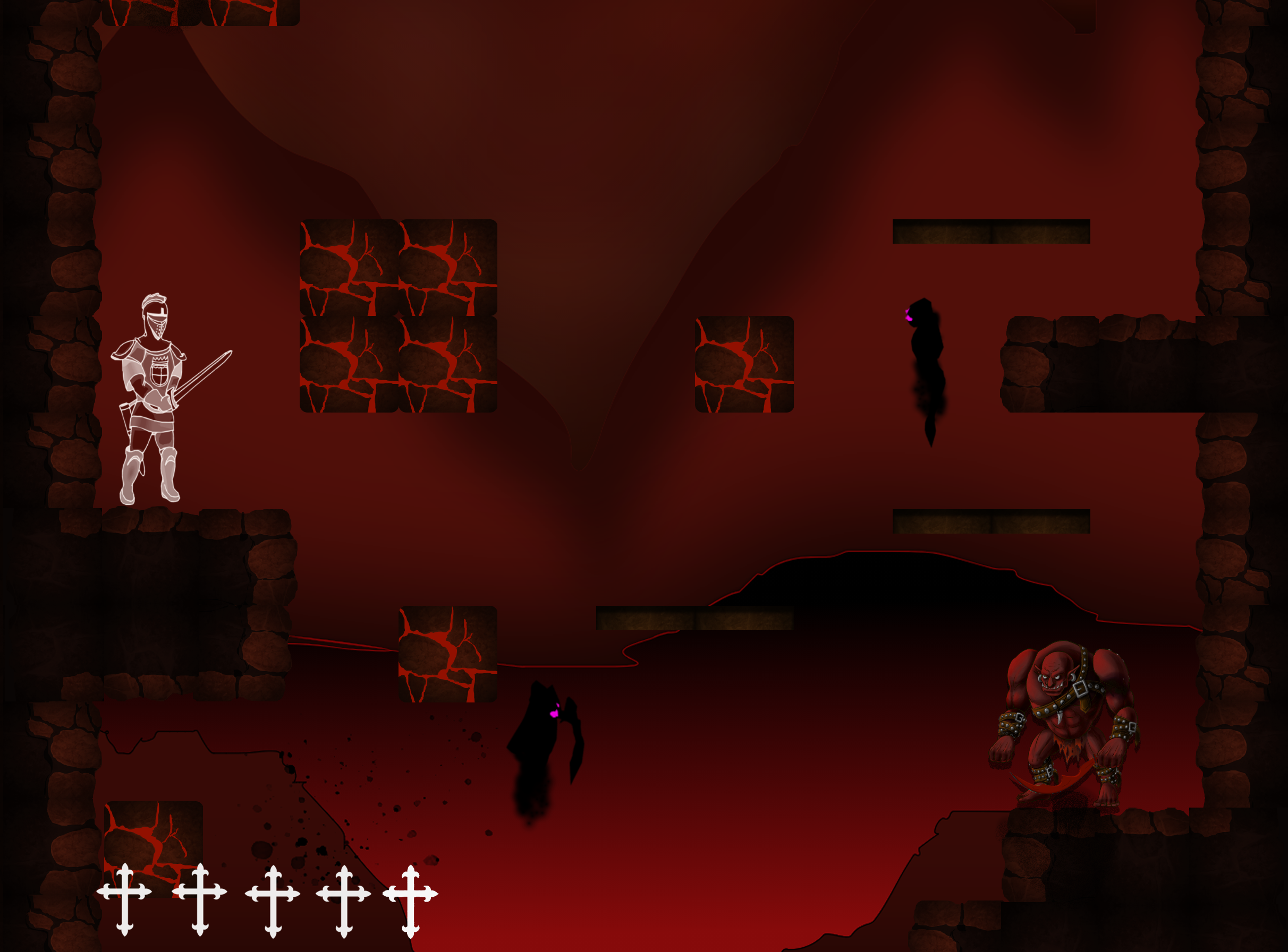
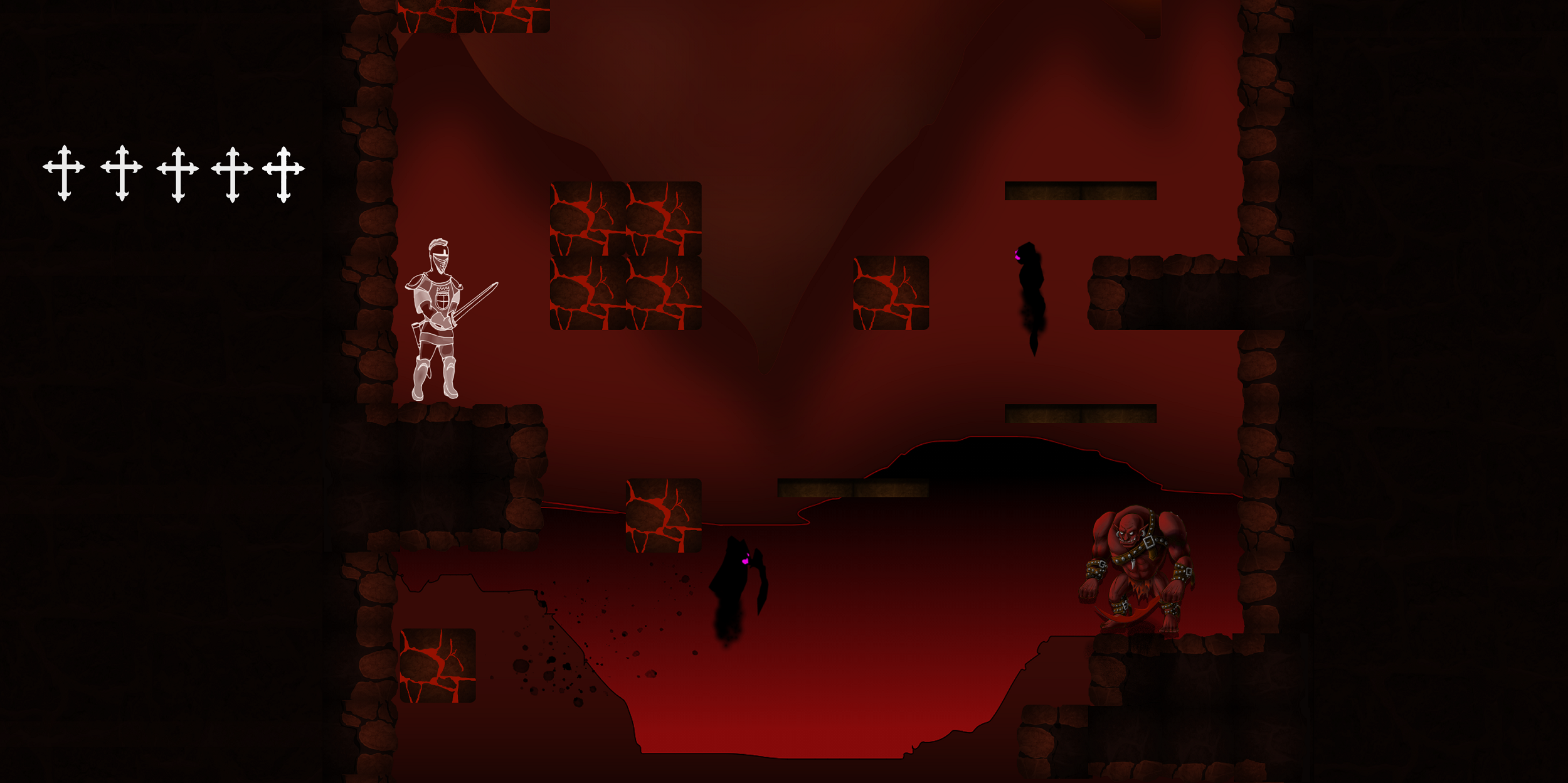
Below are 4 different approaches/directions where I tried out positioning for the faith bar:

a) Faith bar at the bottom left corner in the game area
This is my favorite one. Since the whole game idea is about player going up, faith bar is not occupying the upper side of the screen on which the player has to concentrate the most.

b) Faith bar at the top left corner in the game area
This is more traditional approach to have bar above the player, but as I mentioned, since game will mainly go up, this bar could become a distraction and player could miss some enemies or blocks to destroy/jump on. This means that their gameplay experience will be lessened.
Rest of the design ideas are with bar moved out of the area completely, having it on the side.

c) Faith bar at the top left corner outside the game area
This somehow feels as possible design because now the faith bar is not in the game area at all. Moreover, having separate side block for UI would allow other stats to be placed there as well and it would clearly separate the UI from the game itself. Everything would be orderly packed, so to say.

d) Faith bar at the top right corner outside the game area
Same as c) , just on another side of the screen.
Although these final two design choices would make it easier for UI expansion and less time would be spent to think where to put other stats, I see a potential problem. Having such an important thing as faith (health) bar outside of player’s view would mean that player would have to look away from the game itself all the time. This could lessen the immersion in the game and also, if the game is intended to be fast paced, would drag it down. So the question is:
Which UI and design choice should you choose?
I think that the best answer is – the one that your players like and the one that seems more reasonable and likable for you. Try to make a blend of your player preferences and your thoughts of what would be the best outcome. Ask the players what they like (that’s why I think that it is very important to communicate with people, who will play your game, at the very start of your game’s development) and then try to implement it in best way possible.
What are your thought about the design and UI? What in your mind would make the best experience for players? Type your answer in the comments or you can join game’s Discord channel to talk about the game or make suggestions on how to make it better!
As always, thanks for reading, don’t forget to subscribe for weekly game development blog and have a great day!
FromHell
Roguelike/lite 2d platformer
| Status | Prototype |
| Author | somethingofagamedev |
| Genre | Platformer |
| Tags | 2D, Roguelike, Roguelite |
More posts
- DevBlog#16 Expectations vs reality in game design (Are you ready for random leve...Sep 02, 2021
- DevBlog#15 Procedurally generated environments. Why would you want them?Aug 27, 2021
- DevBlog #14 Don’t spend your time on trying to do everything, instead do this!...Aug 19, 2021
- DevBlog #13 Getting an upgrade and brushing up my logoAug 12, 2021
- DevBlog#11 Game level design and features!Jul 29, 2021
- DevBlog#10 Going further with my game “From Hell”Jul 22, 2021
- DevBlog #9 Major design change!Jul 15, 2021
- DevBlog #8 Possible Weapons design and I'm on Discord!Jul 08, 2021
Leave a comment
Log in with itch.io to leave a comment.